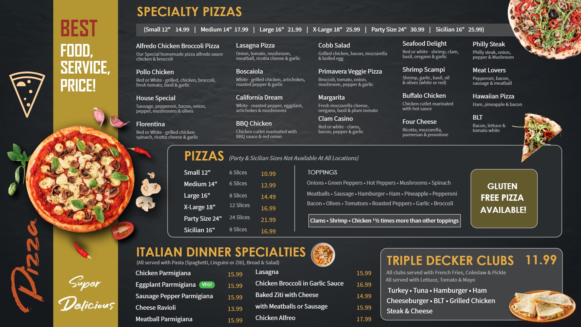
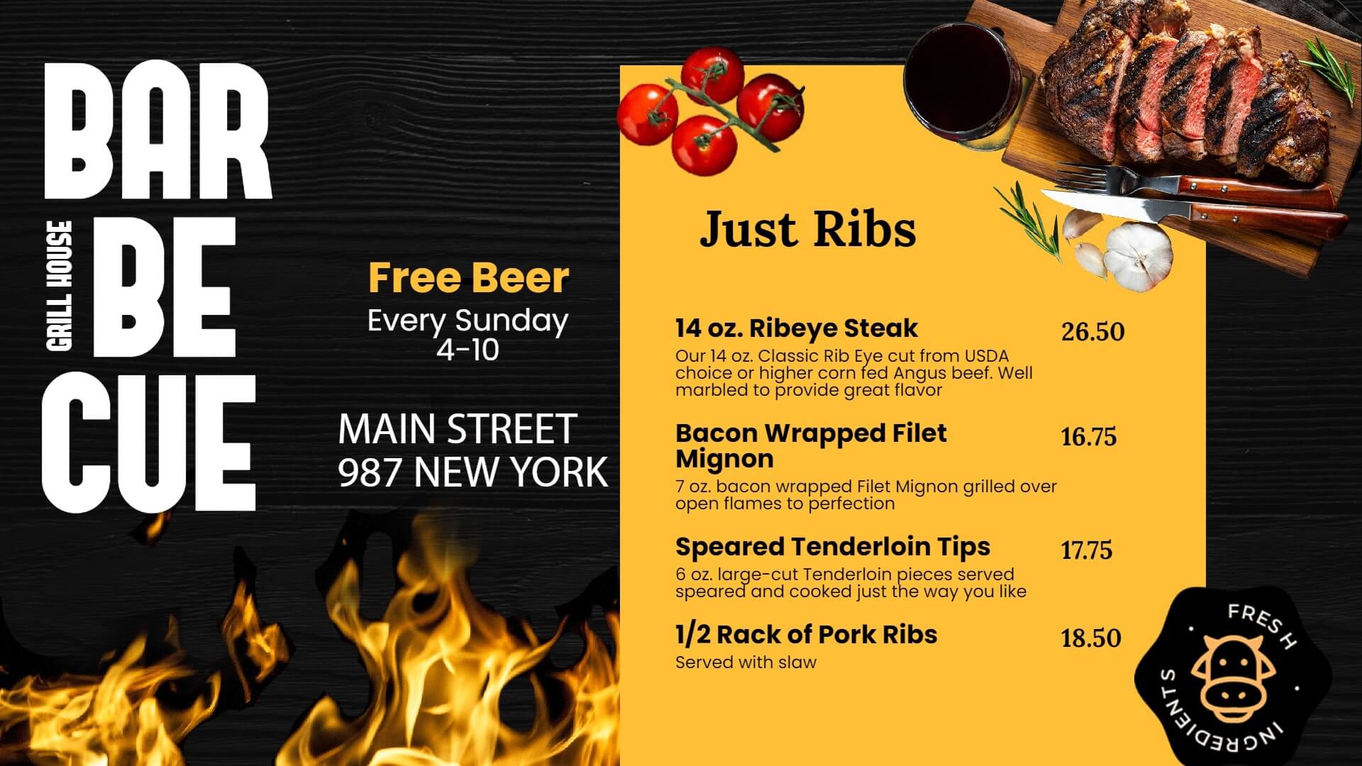
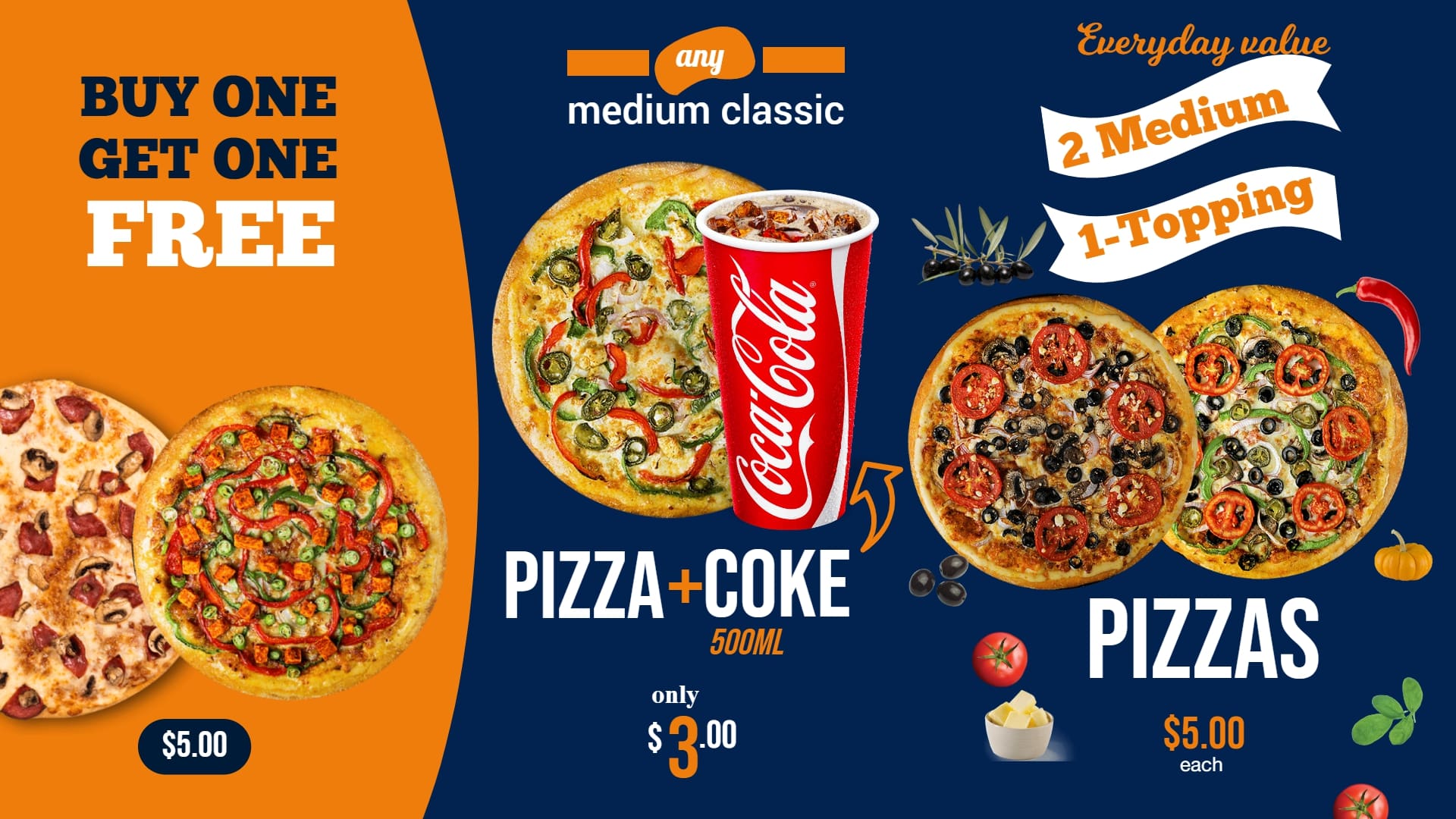
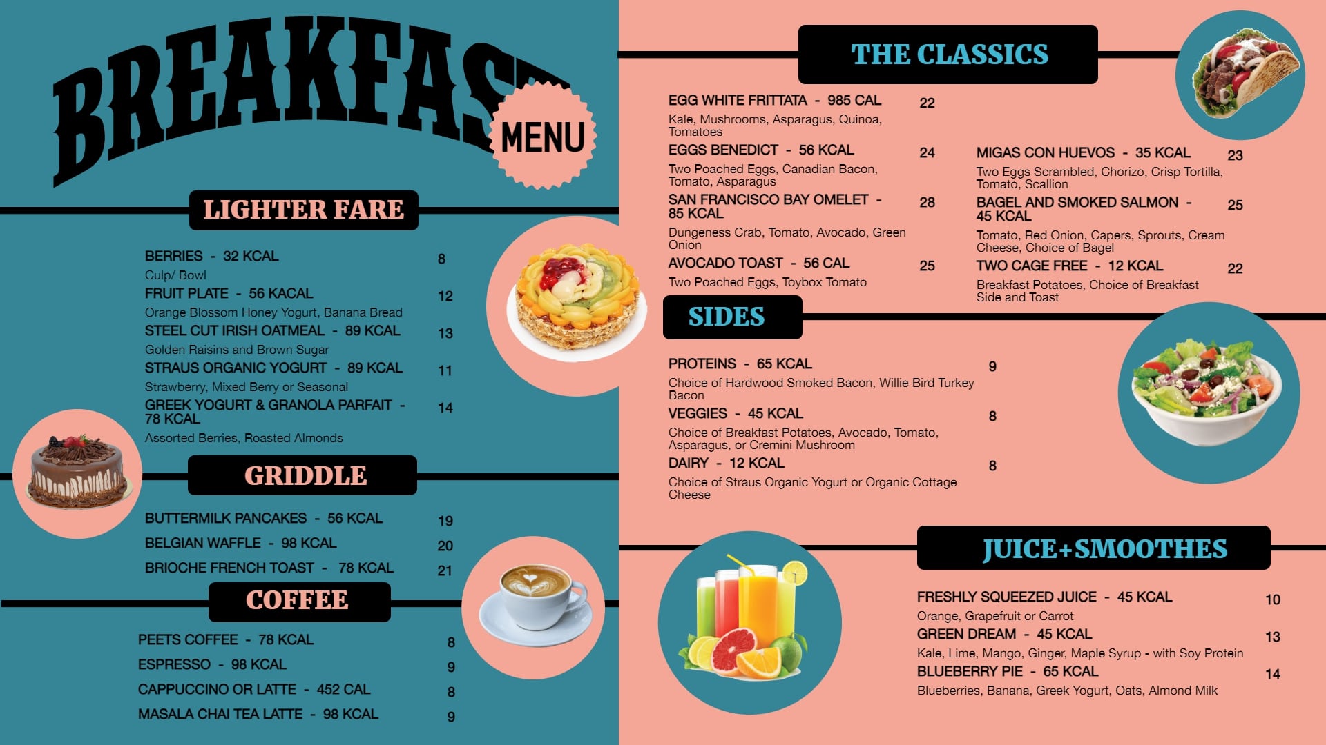
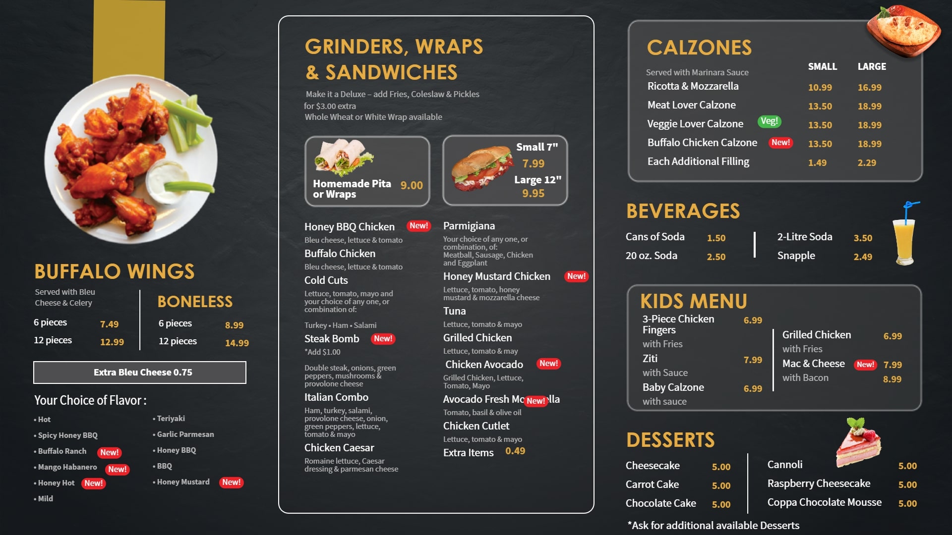
Digital menu boards have captured more attention after the pandemic. They not only help you save on cost but also increase your revenue. A lot of big QSR chains like McDonalds and Burger King gained more than 90 percent of their revenue from the digital menu boards placed at the drive-thru. The situation has bought home the fact that digital menu boards can help significantly elevate their game, regardless of the circumstances.
But just installing signage for menus will not settle everything by itself. Putting up the right TV screen menu board design, creating engaging menu displays and making the most of the menu board will help you get there.
What should a good menu boards have?
Readability – should be quick and easy to read
Attractive High quality food images – HD images are a must to grab attention
Organized layout – clean and clutter free
Brand Consistency – follow same color palette and brand guidelines
Right Fonts – make sure not to choose too cursive or decorative fonts
Today we bring to you 15 awesome ways you can menu board ideas to create a digital menu boards. Follow them like a rule-book and we assure you that it will lead to positive results.
Digital Menu Board Ideas That Increase Your Restaurant Sales
1. Start with a Video - this always works!
A video on the main highlights of your menu or the food being prepared will definitely salivate the diners even more. They might as well decide to order the dish highlighted on the video.
You could either go for a separate screen to display a series of videos or you can simply go on to showcase the video after a certain defined minutes of your menu.
Videos can also be used to promote new items on your menu. A well thought script accompanied with details on the new dish, the uniqueness about it, the ingredients and the taste might make it the crowd favourite.
So, don’t underestimate the power of a good video on a digital menu board.
2. Go for colors that gel in with the vibe you want to have at your restaurant
Colors play a very important role in your marketing strategy. It goes without saying that digital menu boards form an integral part of a restaurant’s marketing efforts, which is why following the right digital menu board design tips can make a real difference.
Right from choosing menu colors and fonts that match your brand profile to selecting the right kind of images, every visual element needs careful attention.
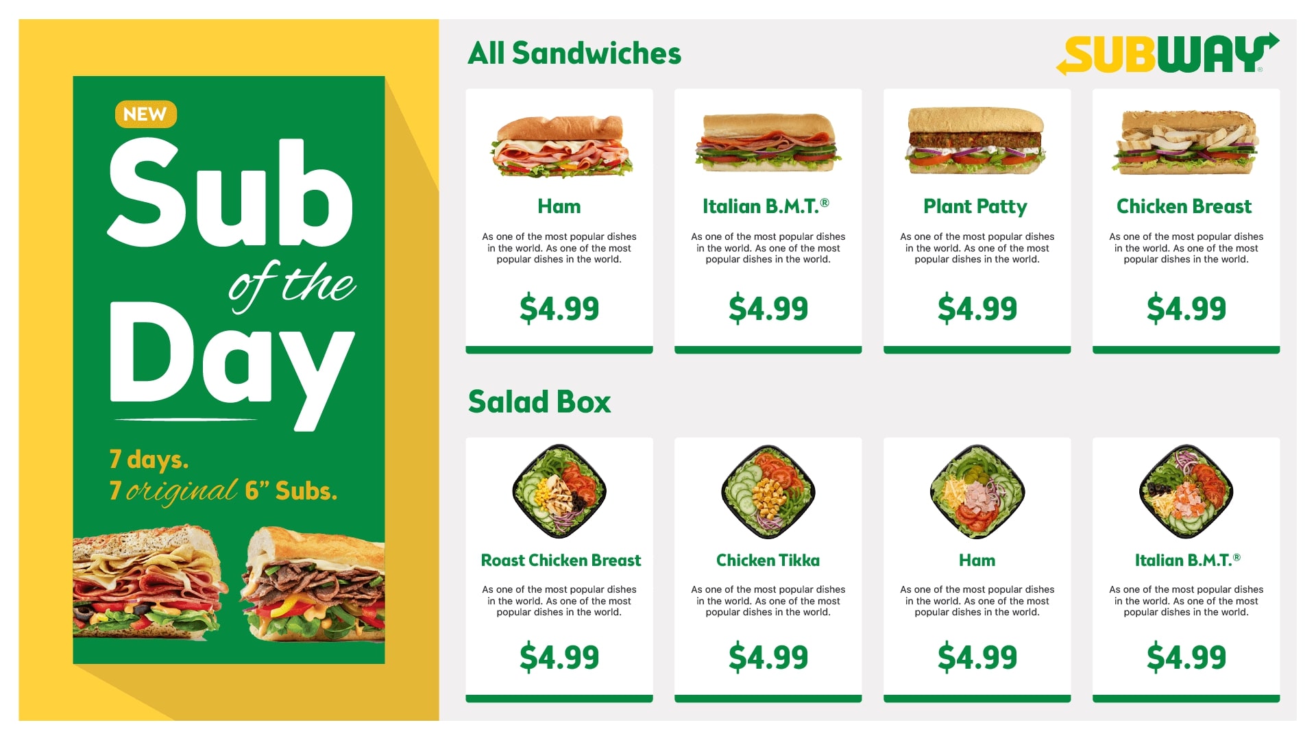
Each color carries meaning, so your logo and overall design should reflect the right symbolism. Take the example of McDonald’s-red and yellow instantly come to mind. Their logo and menu boards consistently use these colors, creating strong brand recall. Similarly, Subway leans on green to reinforce its healthy positioning. This shows how color plays a major role in brand recall and helps you build a strong, recognizable identity.
3. Keep the spacing and the placement right
This is again a very important point that is not paid attention to. While restaurants want to squeeze everything into a single menu board, it could happen that it leads to a chaotic digital menu board designs which might not please the eye.
Simplicity accompanied with the right spacing and placement of the menu text will help you create a right digital menu board designs. Always start with the category of dishes that you want the users to pay attention to or start with your best sellers.
If you are using a digital menu board, you are definitely not into fine-dining so you need not worry about the ordering sequence that is expected from a diner. People are free to order whatever they want and this can be taken to your advantage by placing the items such that more attention is paid to your best sellers.
When it comes to spacing, that is equally important. A clean menu that is less cluttered is much more engaging than the one that has everything just displayed in there.
4. Keep it straightforward so the decision is quick
Menus need to assist in the decision of placing an order instead of just being created for the sake of it. Simply categories every item and display a list of it with the ingredients and prices. It is as simple as that.
Just because you want to create a good menu does not mean you need to complicate it. Also make sure to put your menu on display for a longer time if you have multiple slides to show.
If you are displaying ads of partnered brands, make sure they do not hamper the display or are showcased on a separate screen altogether. It certainly won’t be a good experience for a diner who is checking out the menu and it suddenly disappears due to an advertisement.
5. Play on the customer psyche based on price sensitivity
A lot of brands have successfully played their marketing cards on the price sensitivity and have reaped the benefits. For restaurants as well it is a similar game. According to a study, if the currency sign is not displayed in the menu, then people tend to have more order value compared to the one where a menu has the currency sign displayed.
It seems that the currency sign tends to put a curb on the spending and the diners get conscious of which item they are ordering based on the price. But if the sign is removed, it tends to have a better effect on the ordering ability of the diners.
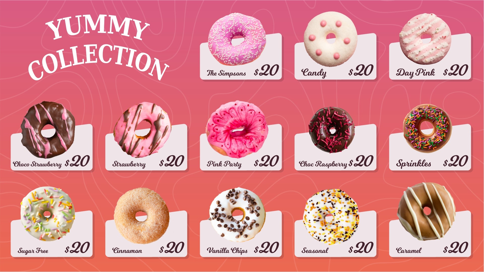
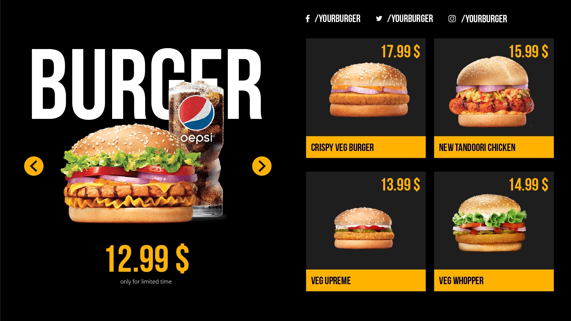
The .99 pricing also plays quite a trick here. Named as ‘charm pricing’, instead of a whole figure, many brands everywhere opt to price items with the .99 to it and this actually works with the purchasing behaviour of the customers. Make sure to put this to a good use on your menu and see how it works for your restaurant.
6. Add subtle animation to your menu
Motion tends to grab more attention than stillness. Well, at least in terms of the menu boards it does. Try to add some animation of any item being prepared or fire animation or spices being sprinkled – it could be anything small but something that grabs attention.
Simply opt to have three-four animations on the menu and go on to update them as and when needed. If you are using digital menu boards, make sure that you put them to the maximum use. Make sure to put the animation in a way that diners are able to read the menu items properly and it does not get in the way.
This will definitely add more to customer experience.
7. Make sure to use the right text sizing, hierarchy and the consistency in the fonts and colors
If you are having two or more menu boards, make sure that you follow the hierarchy in the text size.
The headers should be bigger than the actual items names. The colors of the headers and the fonts should be consistent throughout. The text size of the item names should be a bit smaller than the headers but not small enough that it cannot be read even on the digital menu board.
When it comes to colors, use the colors of headers and the item names in a neutral way. Don’t go for a contrast there since that might look quite abrupt.
8. Put a perfect balance between the text and images on a single menu board
Make sure to strike a balance between the amount of text and images. Don’t have too much text and don’t go on to have too many images. Put relevant images, and do not add more complexity to it.
A user should be in a position to read the menu properly and place order. This can be done only if there is a right balance between the number of images and text placed on a single menu board.
9. Stick to a layout and follow it
Follow a layout for the menu that you will stick to always. If at all you are planning to change the layout, don’t make too many changes. This could lead to confusion for diners who visit your restaurant regularly since they are used to a particular layout.
Also go for a clean layout that helps you play with everything right from the text, the menu items to the images.
10. Choose the right orientation – portrait or landscape
Whether to go with a portrait or a landscape mode for your screen will largely depend on
- The location that you have for your restaurant
- The area that has been allotted for the menu boards
- The number of menu boards that you want to have
- The distance between the order area and the menu boards
- The size of the menu board
You could also go for both – portrait at some places and landscape at another but make sure they are not placed adjacent to each other since that might look quite weird.
11. Keep room for offer displays
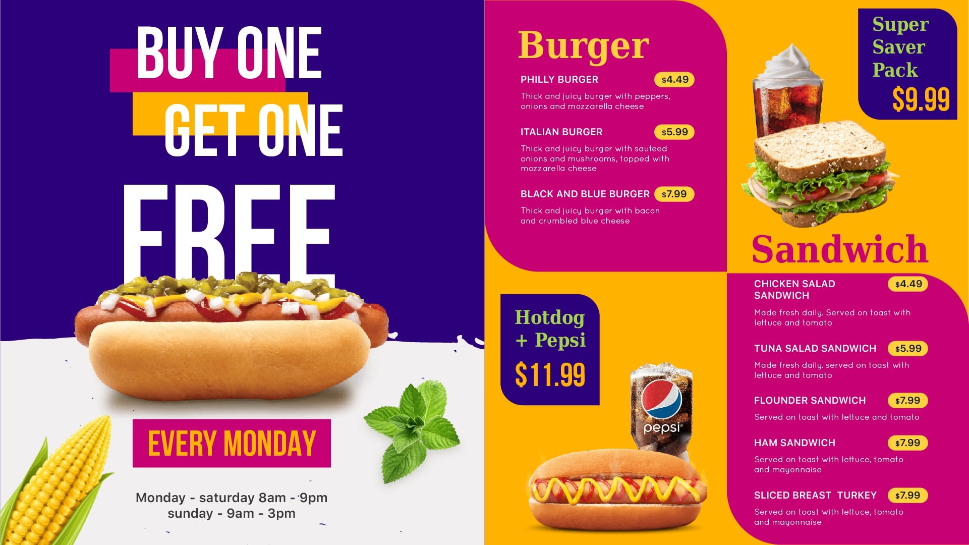
Do not forget to have a separate screen for your offers and if not, make sure that you give the offers in the menu enough screen time. Restaurants tend to get more orders from the offers compared to the regular menu. Be it a BOGO or combos, they usually grab more attention in a QSR.
Don’t miss out on keeping a space for the newly added items on your menu. A single screen for offers, videos, and new arrivals can be used strategically to upsell with digital menu boards, ensuring these items are showcased at the right time to influence customer decisions.
12. Make sure to display the calories and ingredients
A lot of people on medications, with health conditions or with some allergies need to take care of their food intake and the amount of calories they can have. It would be nice to display information like the amount of calories and the list of ingredients as well if possible.
People who are allergic to certain foods can take note of this and place orders accordingly. Restaurants who pay focus on delivery of healthy food should take note of displaying everything. This increases their chances of getting frequent visits and regular customers.
13. Put gluten free or vegan symbols or text to aid customers in ordering
For customers that are purely vegan or only go for gluten free food will only pay attention to such food items. If they are easily highlighted in your menu, it would get easier for them to place orders.
Make sure to highlight the replacement of these ingredients that have been used so they know what they will be getting.
14. Display the food preparation time next to each dish
There are some items that might be served in just five mins while some may take more time say 15 mins or even more. It is wise to display the food preparation time next to each item so if anyone has other plans, they can place their food order accordingly.
You might as well go on to discover some interesting ordering patterns with this idea that can help you get more orders on specific food items that are delivered in a set frame to time to your diners. Though yours might be a QSR which means the service is quick, many items do require some time.
15. Last but definitely not least – Keep your menu updated!
When we say this, we don’t expect you to change your menu everyday. What we mean is take note of removing the out of stock items almost instantly, work on the quality of food images that you have and replace them with better ones every fortnight.
Place more focus on food items that are most liked and keep a menu with those items first.
If the above points are diligently followed and taken care of, we can assure you that they will put you in a different game altogether.
The kind of software that you go for makes a huge difference here. We used cloud based hosting so you can update your menu from anywhere. We also have super easy to edit digital signage template editor. You can simply tweak these and start using them on the go.
Are you looking for a sound and easy digital signage software? Reach us out today at info@dotsignage.com for more details or you can try our 7 day free trial to explore more.

About Smit
Smit Nebhwani, a tech entrepreneur with over a decade of experience, specializes in building successful SaaS products. An authority in digital signage, he shares valuable industry insights through his content. In his free time, he enjoys music, traveling, and family time.
Share this post:
