Your food already does the hard work. The recipes are solid, the presentation looks great, and customers notice the moment their food arrives.
But the menu board that’s supposed to sell those dishes? Most of the time, it’s just sitting there showing the same static content all day.
And in restaurants, people usually decide what they want before they even reach the counter. They react to what grabs their attention first.
That’s why more than 7000 menu boards around the world run on DotSignage. Restaurants use it to create a better customer experience, keep people engaged, and help high-margin items get noticed.
Now we’re making digital menu boards even more dynamic.
DotSignage now supports animated menu boards and direct video uploads, so you can add motion and video content without dealing with extra plugins or complicated setups.
You also don’t need to break your screen into multiple zones just to play a short clip anymore.
It’s a simple upgrade, but it makes your boards feel far more alive, modern, and attention-grabbing.
Quick Start Guide: Bringing Your Menu to Life with Animation
Adding movement to your menu items is a great way to grab attention and highlight your high-margin specials. Follow these simple steps to set up animations in the DotSignage editor.
Step 1: Select Your Highlight
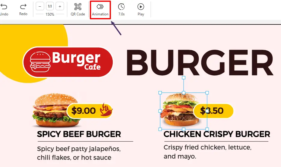
Start by clicking on the specific object you want to bring to life. This could be a photo of your signature burger, a ‘Limited Time’ badge, or your price list.
Once the object is highlighted, look at the top toolbar. An Animation Button will automatically appear. Click it to open the creative panel.
Step 2: Pick Your Animation

Browse the library of effects and select the animation style that fits. We have a total of 9 animation styles available and 2 more for the text animations.
Fade
Smooth, elegant transitions that feel premium
What It Does
Text or images gradually transition from invisible (0% opacity) to fully visible (100% opacity). Creates a smooth, sophisticated appearance that doesn't startle customers.
Best Used For
Category headings ("Breakfast", "Signature Burgers"), background images, premium menu items you want to highlight without overwhelming customers. The subtle motion draws the eye naturally.
Customer Psychology
Customers associate gentle fades with high-end displays and premium brands. It communicates quality and intentionality - This restaurant cares about presentation.
Real-World Example
Use this for your background images or category headings. As the menu loads, your 'Signature Burgers' section softly emerges, giving the board a high-end, polished feel.
Pro Tips
Speed setting: Use "Medium" (2-3 seconds) for food photography - too fast feels rushed, too slow loses attention
Perfect for: High-margin items, daily specials, seasonal promotions you want noticed but not shouted
Pair with: Dark backgrounds for maximum contrast and visual impact
Don't use on: Prices (customers need those stable) or small text (fading makes it harder to read)
Slide In
Dynamic entrance that builds anticipation
What It Does
Elements slide into view from the left, right, top, or bottom of the screen. Creates a sense of movement and reveals content progressively, building customer interest as items appear.
Best Used For
New menu items, limited-time offers, promotional banners, and combo meal descriptions. The directional movement naturally guides the eye to where you want customers to look next.
Customer Psychology
Movement from the side mimics turning a page or opening a door - it signals 'something new is being revealed.' Creates anticipation and makes announcements feel like discoveries.
Real-World Example
Set your Daily Special pizza to slide in from the right. It acts like a 'curtain raiser' for your star dish, physically pulling the customer's eyes toward the new addition.
Pro Tips
Speed setting: "Short" (1-2 seconds) for announcements, "Medium" for menu items—fast enough to notice, slow enough to track
Direction matters: Slide from left for Western audiences (reads left-to-right), from top for urgent announcements
Perfect for: "NEW" badges, daily specials, happy hour promotions
Don't use on: More than 2-3 slide in direction for single section or part in design - too much sliding becomes chaotic
Shrink
Attention-grabbing reduction that creates focus
What It Does
Elements scale down from their large size to a actual size. Creates a "pulling back" effect that paradoxically draws attention - the shrinking motion triggers the eye's movement-detection instinct.
Best Used For
Price callouts, discount badges, 'Limited Time' labels, and promotional stickers. The shrinking creates urgency - it feels like something is about to disappear.
Customer Psychology
The shrinking motion triggers loss aversion - "Wait, is that going away?" - making customers notice time-sensitive offers. Works especially well flash sales.
Real-World Example
Start with a massive, mouth-watering close-up of your Smoked Salmon Bagel that fills the screen, then watch it shrink down right next to its price. It ensures the customer sees the quality before they see the cost.
Pro Tips
Speed setting: "Short" for urgency (sale prices, limited offers), "Medium" for regular promotions
Perfect for: Discount percentages, "Only Today" badges, combo deal callouts
Combine with: Bright colors (red, yellow) to amplify the urgency signal
Don't use on: Brand logos (undermines authority)
Expand
Bold growth that demands attention
What It Does
Best Used For
Hero menu items (signature dishes, chef's specials), food photography, 'Best Seller' badges, and new product launches. The expanding motion says 'pay attention to this.'
Customer Psychology
Growing objects feel abundant and generous - perfect for communicating "loaded," "stuffed," or "extra" menu items. Subconsciously signals "you're getting more."
Real-World Example
Use this for a Family Pizza Deal or Combo Meal. As the text 'feeds four people' expands toward the customer, the perceived value of the meal grows right along with it.
Pro Tips
Speed setting: "Medium" to "Long" (3-4 seconds) - slow expansion feels premium, fast feels aggressive
Perfect for: Food photography (especially messy, loaded dishes), "Bestseller" items, upsell suggestions
Works well with: High-resolution images - expansion draws attention to detail and quality
Don't use on: Small items (expands too much, looks distorted)
Spin
Motion that keeps eyes locked in
What It Does
Elements rotate in a full circular motion for a few seconds before smoothly stopping in their final position. Creates a playful "spinning into view" effect that instantly grabs attention.
Best Used For
Pizza images, combo meals, circular food items, limited-time offers, and promotional badges. Especially effective for foods customers already associate with movement, sharing, and excitement.
Customer Psychology
Rotating motion naturally pulls the eye because the brain tracks movement differently than static objects. Spin animations create energy, excitement, and anticipation - making menu items feel more fun, fresh, and crave-worthy.
Real-World Example
Pro Tips
Speed setting: “Long” (1–2 seconds) - smooth spinning feels modern and premium, while overly fast rotation can feel distracting.
Perfect for: Pizza promotions, circular dishes, combo offers, “Hot Deal” graphics, and limited-time specials.
Works well with: High-quality food photography and subtle scaling effects for extra visual impact.
Don’t use on: Text-heavy layouts or detailed menu descriptions - spinning makes small text harder to read.
Flash
Quick brightness burst for urgent attention
What It Does
Elements briefly brighten, creating a "blinking" or "glowing" effect. The quick flash acts like a visual tap on the shoulder - impossible to ignore without being obnoxious.
Best Used For
Flash sale announcements, "Order Now" buttons, last-call promotions (like happy hour ending soon), and urgent notifications. Use sparingly -flash demands immediate attention.
Customer Psychology
Flashing triggers urgency and alertness - the human brain is wired to notice sudden changes in brightness. Signals "act now" or "don't miss this."
Real-World Example
If you are running a Happy Hour or a 'Lunch Flash Deal' on bagels that ends at 3 PM, apply this to the 'Order Now' text. It creates a visual siren that demands an immediate decision.
Pro Tips
Speed setting: "Long" - frequent flashing is irritating, infrequent flashing gets missed so don't use short time.
Perfect for: Time-sensitive offers, low-stock alerts, special event announcements
Color choice matters: Yellow/amber = caution/urgency, red = immediate action, green = positive flash (new item available)
Don't use on: Multiple elements simultaneously (creates visual chaos) or continuously without breaks
Pulse
Rhythmic breathing that maintains presence
What It Does
Elements gently grow and shrink in a continuous loop, creating a "breathing" or "heartbeat" effect. The subtle, rhythmic motion keeps items present in peripheral vision without demanding constant attention.
Best Used For
"Hot & Fresh" indicators, live status badges ("Now Serving"), special icons (heart for favorites), and call-to-action buttons. The pulse says "this is active right now."
Customer Psychology
Rhythmic pulsing mimics life and freshness - like a heartbeat or breathing. Perfect for communicating "fresh," "live," "hot," or "active" without words. Subconsciously reassuring.
Real-World Example
Apply a gentle pulse to your highest-margin item, like a premium stuffed-crust pizza. It acts as a subconscious reminder, keeping that item top-of-mind while customers browse the rest of the menu.
Pro Tips
Speed setting: "Long" -mimics natural breathing. Too fast feels anxious, too slow isn't noticeable
Perfect for: Freshness indicators, "New Arrival" badges, live status updates, favorite/popular item markers
Don't use on: Large images or static content that doesn't need "alive" quality
Pop
Instant attention with energetic movement
What It Does
Elements quickly “pop” into view with a sudden burst of motion, creating the feeling that the item is jumping toward the customer. The animation appears fast, playful, and impossible to miss.
Best Used For
Limited-time offers, discount badges, combo deals, add-ons, and impulse-buy menu items. Perfect for grabbing attention in busy restaurant environments where customers scan menus quickly.
Customer Psychology
Sudden movement naturally interrupts browsing behavior and forces the eye to focus. Pop animations create excitement and urgency, making items feel fresh, fun, and worth noticing immediately.
Real-World Example
Use this for 'New Item' badges or 'Chef's Special' labels on a new burger. It makes the badge look like it is floating off the screen, making the dish feel more exciting and exclusive.
Pro Tips
Speed setting: “Short” or “Medium” - quick pops feel energetic and attention-grabbing without becoming distracting.
Perfect for: Special offers, combo upgrades, “New Item” labels, discounts, and upsell suggestions.
Works well with: Bright colors, bold typography, and promotional badges that need immediate visibility.
Don’t use on: Too many elements at once - excessive popping can make the menu feel chaotic and overwhelming.
Bounce
Playful motion that brings menus to life
What It Does
Elements move into view from the top-left direction with a bouncing motion before settling into their final position. Similar to a ball dropping and bouncing into place, the effect feels lively, energetic, and full of motion.
Best Used For
Fun food items, kids’ meals, desserts, beverages, combo deals, and promotional graphics. Bounce animations work especially well for casual restaurants, cafés, food trucks, and fast-food menus.
Customer Psychology
Bouncing motion creates a sense of energy and excitement that naturally attracts attention. The playful movement makes menu items feel more approachable, fun, and interactive - helping the display feel more dynamic and engaging.
Real-World Example
Imagine a cheesy pepperoni pizza image bouncing onto the screen from the top-left corner before settling perfectly beside the text “2 Large Pizzas + Garlic Bread.” The bouncing motion feels energetic and fun - making the deal appear more exciting and attention-grabbing, especially during lunch or dinner rush hours.
Pro Tips
Speed setting: “Medium” - smooth bouncing feels playful without becoming distracting.
Perfect for: Desserts, drinks, kids’ combos, seasonal specials, and pizza promotional offers.
Works well with: Bright food photography, casual restaurant branding, and animated promotional badges.
Typewriter
Text animation that builds curiosity
What It Does
Words appear one letter at a time, just like they are being typed on a real typewriter. The gradual reveal creates anticipation and keeps customers focused on the message until the full sentence is complete.
Best Used For
Daily specials, promotional messages, combo descriptions, limited-time offers, and storytelling-style menu text. Perfect when you want customers to actually read the content instead of quickly scanning past it.
Customer Psychology
The human brain naturally waits for incomplete information to finish. Typewriter animations create curiosity and anticipation, encouraging customers to stay engaged longer and pay attention to every word being displayed.
Real-World Example
Imagine the text slowly typing out: “Warm & Crispy Delight” on top of a warm bagel image. As each word appears one by one, customers naturally keep reading to see the full menu item - making the product feel more fresh, handcrafted, and worth ordering.
Pro Tips
Speed setting: “Medium” - slower typing improves readability and builds anticipation.
Perfect for: Café menus heading, breakfast specials, and promotional taglines.
Works well with: Minimal layouts, clean typography, and high-quality food photography that supports the story being typed.
Don’t use on: Long paragraphs or fast-moving menu sections - too much typing can slow down customer browsing.
Textfade
Smooth text reveals that feel clean and modern
What It Does
Words appear one by one using a quick fade-in transition instead of typing letter-by-letter. Each text element softly fades into visibility, creating a smooth reading flow that feels elegant and easy on the eyes.
Best Used For
Menu headings, promotional messages, combo descriptions, pricing highlights, and rotating daily specials. Perfect for modern restaurant displays that want subtle movement without overwhelming customers.
Customer Psychology
Fade animations guide customer attention naturally without feeling aggressive. The soft appearance effect keeps menus readable while still creating enough movement to hold visual interest and improve focus on important text.
Real-World Example
Pro Tips
Speed setting: “Short” to “Medium” (1–2 seconds) — quick fading keeps menus smooth and readable without slowing customer decisions.
Perfect for: Café menus, breakfast boards, combo descriptions, pricing text, and promotional highlights.
Works well with: Minimal layouts, clean typography, and subtle background motion for a polished modern look.
Don’t use on: Extremely large text blocks - too many fading lines can reduce readability and slow menu scanning.
Step 3: Control the Speed (Duration)
The duration determines how long the actual movement takes to complete.
Custom Durations: Short, Medium, or Long
- Short: Fast transitions for high-energy moments. Great for ‘Order Now’ buttons, limited-time countdowns, or price reveals.
- Medium: Standard item reveals. Works for most menu boards across most restaurant types.
- Long: Slow, atmospheric fades. Perfect for a steam effect above a hot ramen bowl or tangy sauce being applied to hot ribs.
A Friday night pizzeria rush hits differently than a slow Tuesday morning bagel spot.
One needs energy and speed. The other needs warmth and calm.
Your animation speed should match your vibe.
Step 4: Add time and sequence to your animations
This is where it gets powerful.
Instead of everything appearing on screen at once which overwhelms customers, you can now control exactly when each element appears.
Here’s what a sequenced burger board looks like:
- 0 seconds: High resolution burger image slides in. The hook.
- 1.5 seconds: The description fades in underneath. The persuasion.
- 3 seconds: ‘Add Fries & Drink for ₹150 more’ badge pulses into view. The upsell.
You’re not showing a menu. You’re telling a story.
And you’re directing where the customer’s eyes go and what they end up ordering.
Step 5: Keep the Momentum (Repeat Interval)
To ensure your menu stays eye-catching for customers who walk in at different times, use the Repeat function.
- How it works: Set a custom interval, such as 10 or 20 seconds.
- The Result: Your animation will replay every time that interval passes. This keeps the screen feeling alive without being distracting.
Quick Tips:
- Direct the Eye: Only animate the items you want to sell the most. If everything is moving, nothing stands out.
- Test the Timing: Give your customers enough time to read the text before the animation repeats. A 15-second loop is usually the perfect balance for readability.
- Layer Your Effects: Try setting your main dish to appear at 0.5s and your price to appear at 1.5s to create a high-end, choreographed feel.
Videos on Your Menu Board Without the Multi-Zone Headache
Here’s something a lot of restaurant owners have dealt with for years.
You want to show a sizzle reel of your best dish. A close-up of cheese pull. Steam rising off a bowl of ramen. Your chef at work.
But to do that, you had to split your screen into zones. One zone for the video. Another zone for the menu text.
Then you’d spend 30 minutes trying to get the sizing right.
With the new update of DotSignage, videos being directly added to the menu template from the editor, you can drop a video clip directly into your menu board layout.
The video plays right where you place it. Alongside your menu items, your pricing, your branding. It all lives in one clean layout.
Other additional stuff that matters
Better Menu Alignment – Snap-to-grid precision that makes your layouts look intentional, every time. No more elements sitting slightly off. Everything lines up clean.
Whether you’re placing a price tag or a promo badge, it snaps exactly where it should.
Your boards look like a designer built them, even if you did it in five minutes between orders.
Eyedropper Color Picker – Grab any color from anywhere on your screen and keep your branding pixel-perfect.
See a shade you like on your logo or a photo? Pick it instantly.
No more guessing Hex codes or trying to eyeball a match. Your brand color is your brand color. not a close-enough version of it.
Drag & Replace Images – Upload and replace any image with the same formatting as the replaced image. Just drag and drop. Your layout stays exactly as it was and you save a lot of time and effort involved in getting it look just right.
Swapping a seasonal dish photo or updating a promo visual used to mean rebuilding half your board. Not anymore. Drop the new image in and you’re done in under 2 seconds.
Multi-Select Objects – Select multiple elements at once and move th em together. Rearrange your entire layout in seconds, not minutes.
If you’ve ever needed to shift a whole section of your board like a price, a label, and an image all together, you know how painful it was doing it one element at a time.
Now you grab them all and move them as one.
The Bottom Line
Your food deserves better than a static board.
You've put the work into every recipe, every dish, every plate. Your menu board should work just as hard as you do.
Animations that stop people mid-step. Videos that make mouths water before anyone reads the price. Sequenced storytelling that guides customers toward bigger orders. One-click updates that work across every location you run.
This is all live. Right now. In your DotSignage dashboard.
Log in today. Pick one item on your board. Add a Pulse or a Flash. Push it live.
See what happens to your sales on that item this week.
Head to your DotSignage Dashboard to get started.
New to DotSignage? Start your 7-day free trial - no credit card needed.
Questions? Drop us a line at info@dotsignage.com
Get the Best of Digital Menu Boards at Just $10!
No Credit Card Required

About Smit
Smit Nebhwani, a tech entrepreneur with over a decade of experience, specializes in building successful SaaS products. An authority in digital signage, he shares valuable industry insights through his content. In his free time, he enjoys music, traveling, and family time.
Share this post: